New Year, New Hue for 2022! How to Introduce Pantone’s “Very Peri” Into Your Home

simplenotsimple_style_door
Need a home design refresh? Meet Pantone's color of the year for 2022 -- find out how simple tips from an expert can help freshen up our homes with this "daring and courageous color". Photo by Behzad Ghaffarian on Unsplash

Pantone’s Color of the Year announcement is one of the most awaited events in the design industry, as the chosen color—which is chosen by Pantone experts based on studies of trends over the years—is used in creating products in the interior, product, and fashion design fields.

The color authority’s declared pick for 2022 is Very Peri, which, according to the site, is a “daring and courageous color” meant to reflect the changing sensibilities of our world.

simplenotsimple_style_peri2
simplenotsimple_style_pantone
Hello, purple! Don't be intimidated by this "ube" hue, in just the right doses, this cool color can add a breath of fresh air into your home

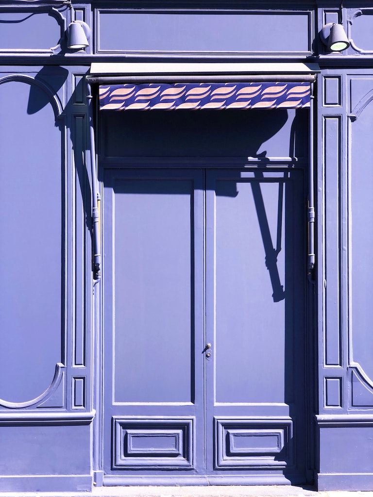
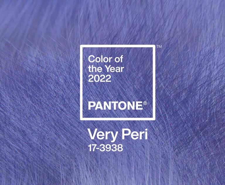
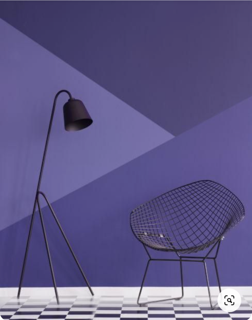
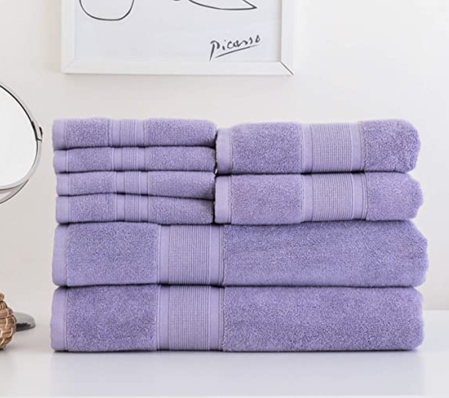
Inspired by the color periwinkle, Very Peri is a medium-violet tint with a sharp undertone of blue, and this is where “daring and courageous” comes in: it can be a bit tricky to use!

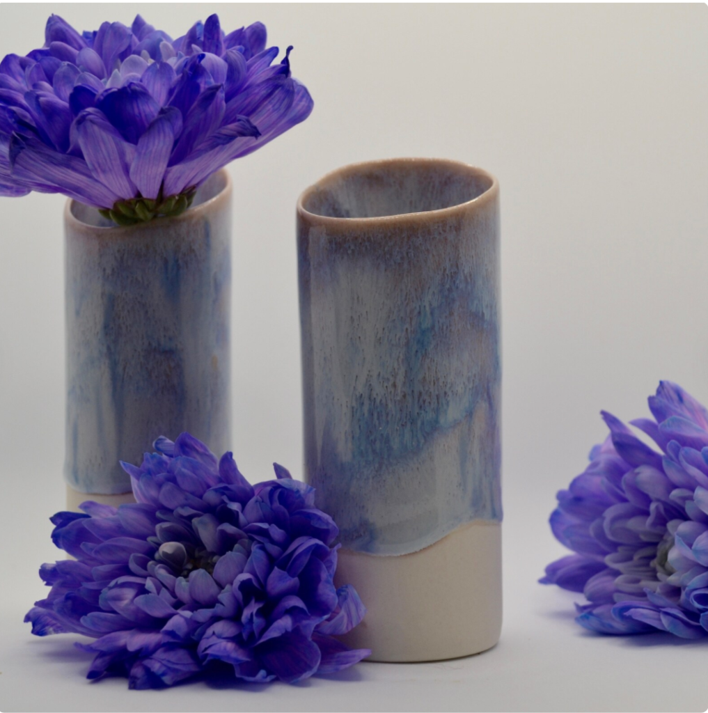
Unlike other past, popular Pantone Colors of the Year which were mostly in the warm tones that go well with beige, brown, and other toasty neutrals, Very Peri is a cool hue, and thus works best with other cool tints such as blue, mint green, pure white, cool gray, and other colors in the lavender-purple family.

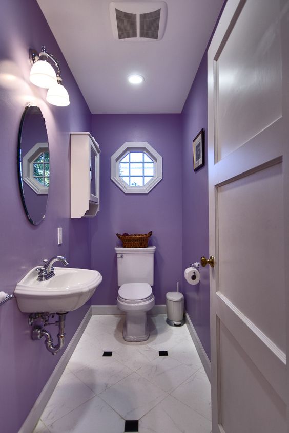
So, if you are not used to cool colors, I’d say it is safest to use Very Peri in white, light beige, and light gray interior palettes.

But it’s still quite easy to incorporate the Color of the Year into your home. Here are some suggestions on how you can use it: 

In pillows, throws, and other soft furnishings

Throw pillows in Very Peri would stand out against a white or light beige sofa. Choose pillows in different textures or patterns: tweedy or plain-colored twill, paisley or ikat print. A Very Peri throw would look great on a dark gray L-shaped sofa, too.

simplenotsimple_style_amazonthrowpillow
Change out your old throw pillows for some Very Peri ones. The perfect accent to a white or beige sofa. Throw pillow from Amazon
Make a dark gray sofa cozy with this plush purple throw. Periwinkle throw blanket from Atlanuh

In decorative accessories

Vases and other small tabletop accessories could add just a wee bit of Very Peri to your space, if you’re color-shy.

But if you’re truly brave, add a deep Very Peri sofa to your vignette—it will make a stunning accent against a dark gray wall.   

Just a touch of this bold color in pretty pottery adds some sugar and spice to your space. Porcelain ceramic by CarysBoyleCeramics
simplenotsimple_style-farberware
Who says kitchenware needs to be boring? Add an appetizing flavor to your kitchen with some eyecatching pots and pans. Kitchenware by Farberware

In nature—through your plants and cut flowers

Another subtle way to incorporate Very Peri into your home is through fresh (or faux) flowers.

Orchids, purple statis (this can be dried and used for a very long time), or even simple mums come in this beautiful, soothing color.

simplenotsimple_style_orchid
Fresh orchids or other floral varieties are an easy temporary choice if you're not quite ready to commit to this vibrant color. Photo by José Ignacio González Pansiera on Unsplash
Opt for dried flowers on a foyer table for a low maintenance alternative. Photo by Michelle Tresemer on Unsplash

As paint in a children’s room

Very Peri is a nice, unisex hue that isn’t as predictable as baby pink or powder blue. Plus, this color grows up well with the child; no need for repainting when they reach the tween and teen years! 

Use this color sparingly in a kid's bedroom or playroom with graphic wall stickers. Design from Tenstickers
simplenotsimple_style_wall
Or go all out with paint and play around with shades from the same color palette. Design from Westwing Italy

In a powder room

Your powder room is the smallest room in your house, and because of this, you can be quite experimental with it. Paint the walls around your tiles in Very Peri to give this space a cozy, cocooning effect.

simplenotsimple_style_powderroom
A small powder room handles this tricky color easily -- giving the tiny space a cocooning effect. Design image from Shelterness
Or test it out it small doses with towels in this soft hue. Towels by Luzia
simplenotsimple_style_candle
What bathroom isn't complete without a pretty candle or two in this "aesthetic" color. Candle by Sephora

So whether you choose to dive in with both feet or choose to take small bite size accents of Very Peri into your home — let this “daring and courageous color” resonate with you as we enter the year that calls us all to be both daring and courageous as well. 

simplenotsimple_style_rachgoldo
Author Rachelle, here with son Goldo, enjoys writing about design, museums, art and how she makes tiny condo living work for her as a busy wfh mom
Guest contributor Rachelle Medina is a licensed interior designer and the former editor of Real Living, the Philippines’ leading home and shelter title. Rachelle has covered the home and lifestyle beat for the past 20 years, and is currently a content editor for various design and art websites. Follow her on Instagram @rachelle.medina.design and read her blog for more design inspiration.

SHARE

Share on facebook
Share on pinterest
Related Posts